

Drag & Drop Editor

Drag & Drop Editor can be found in the Sales Funnels & Content Site components. It's the tool for you to customize your page. You can change the font style, add video, opt-in form or whatever you want to make your page attractive.
Every page created with Drag & Drop Editor is fully mobile responsive which means it's resized automatically to fit the width of the screen of every device eg. iPad, iPhone or tablet.
In this tutorial, we will show you the basic options of the Drag & Drop Editor.
Panel Options
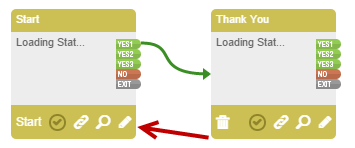
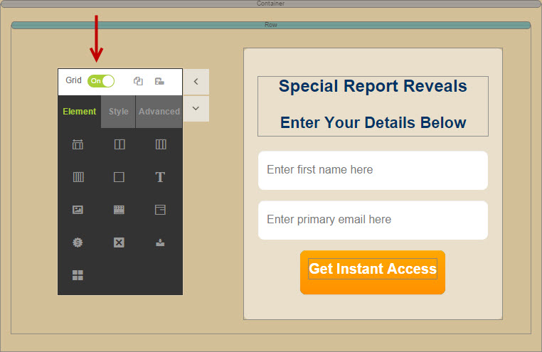
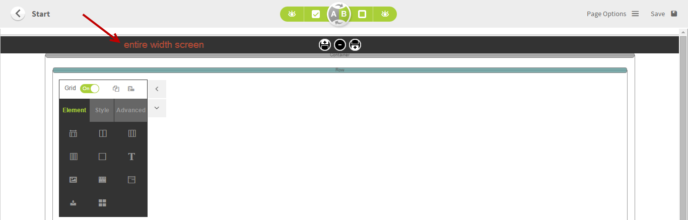
You can find the Drag & Drop Editor in the Sales Funnels. Click the pencil to access the sales funnels map.
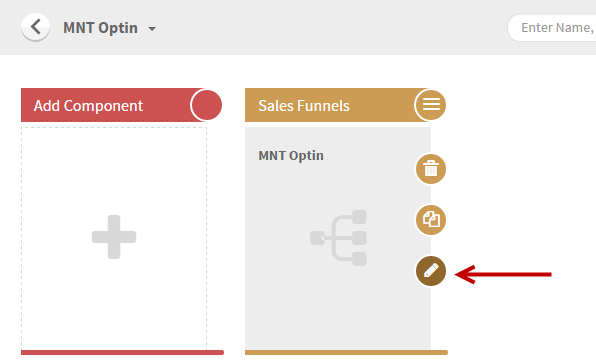
Locate the page that you wish to customize and click the pencil icon.
Then you will find the Drag & Drop Editor. It's the panel on the lefthand side. You can move it anywhere you want on the page.
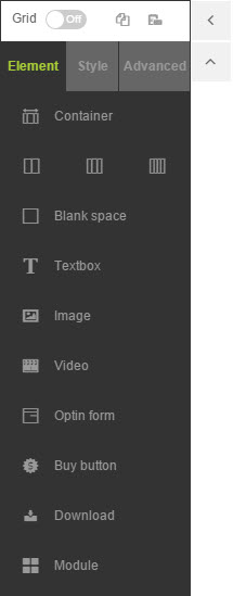
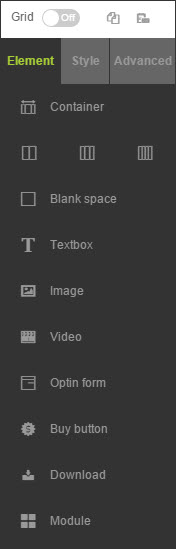
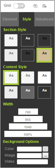
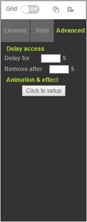
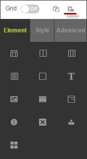
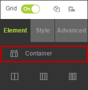
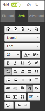
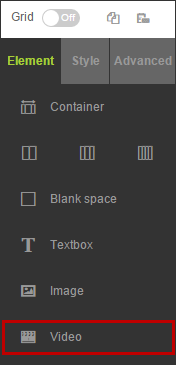
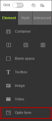
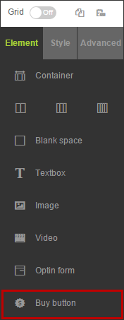
The Drag & Drop Editor has 3 main tabs: Element, Style & Advanced.
- Element tab is to set up and put the content of the page.
- Style tab is mostly to put the theme or some adjustment of the element. The Style option of each element differs.
- Advanced tab is to set up the advance option of the selected element eg. the delay or remove option.
Element Tab
Style Tab
Advanced Tab
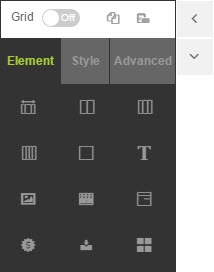
You can expand or minimize the panel by clicking the  or
or  on the right side of the panel. If you want to hide the panel, click
  or click
  to show the panel.
Full Panel
Minimized
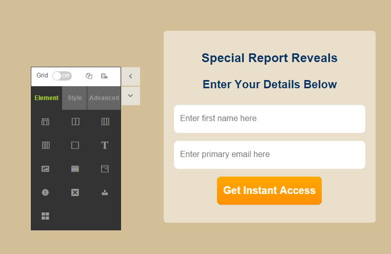
You can turn on or off the Grid to see the gridline which helps you to locate the elements more precisely.
Grid On
Grid Off
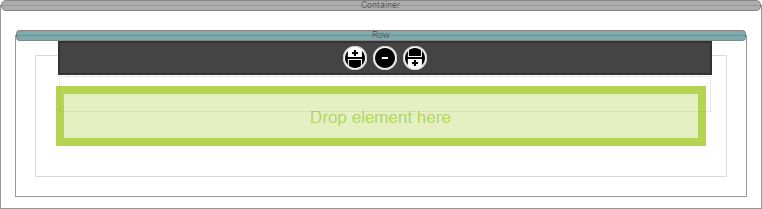
When you drag the element to the page, you can drop it only if it turns green.
Also you can copy & paste the element so you don't need to adjust the element style again.
Copy
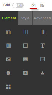
Paste
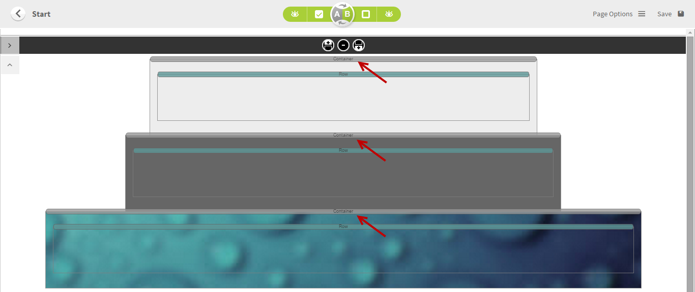
Containers & Columns
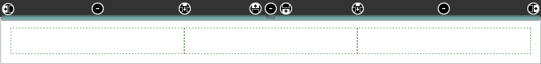
Once a blank page is added, you will see the default container (sometimes called fluid container) which shows the full area of your screen. You can only add the elements inside the containers.
You can always add new containers. You can have as many containers as you want in one page. Add a new container each time you want to start a new width or new content with a different background style. The container can be added vertically only.
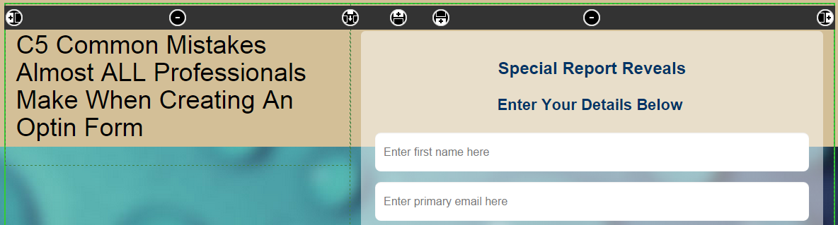
The selected element would show the black bar at the top.
Entire Column Selected
Text Element Selected
Opt-in Box Selected
Each selected element would show the options at the black bar.
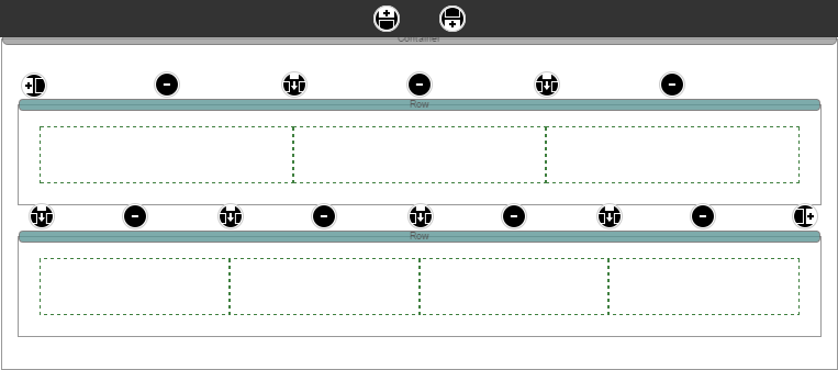
 Add a column to the left
 Add a container above
 Add a column in between
 Add a column to the right
 Add a container below
 Remove the element or column
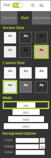
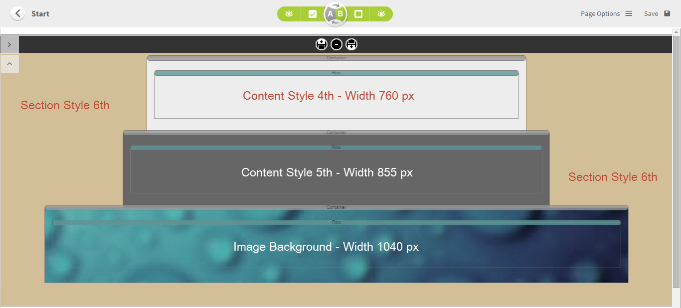
Click the Style tab to select the style and width as well as the Background Options. You can put the color, image or
-
Section Style is the entire area of the fluid container (
full screen container). - Content Style is the style of the page area
- Width is the fixed width of the page area. 100% is to make the page area auto-full screen.
- Background Options is to set up the background of each container.
Blank Space
Blank space is used when you would like to have a space between elements.
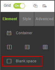
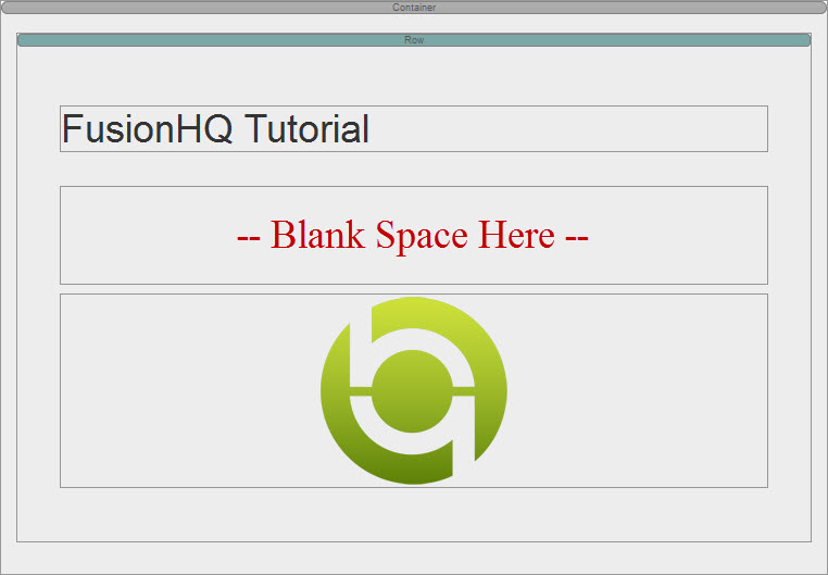
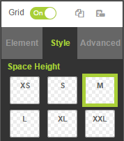
At Style, you can select the height of the blank space from XS to XXL.
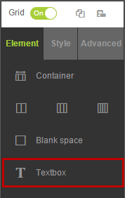
Text Box
Text Box is used for typing text or creating link content.
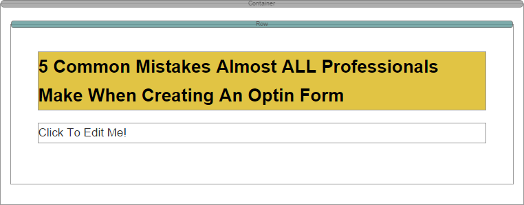
If you want the Text Editor to appear on the existing words, simply click the word(s) to activate the text panel at Style tab.
With the text panel, you are able to change the font style, font color, the H tag, text alignment.
- Click either
 or
or  to clear out the text style before pasting.
 - Click
 to remove the embedded style of the highlighted text.
 - If you want to make the text link, click
 and fill in the redirect
 url . - For the anchor link (link on the same page),
click 
. Name the spot and use icon to put the link. -
Click
 to insert the image.
-
Click
 to insert some available tags eg. to show the email of the customers or AuDHBVn2 to show the password to access the membership site.
Click
 to view the source code of the text. You can use this function to paste any custom code. Vimeo users, please use the source to display the video.
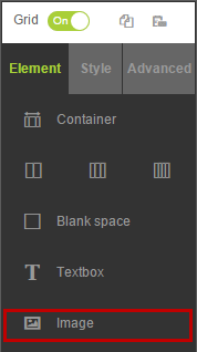
Image
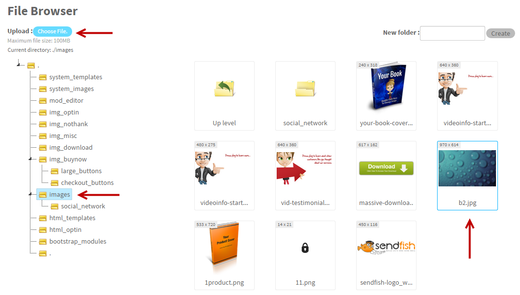
Image is used to insert the image to your page. You will find the image directory where you can select the folder and image. Feel free to create a new folder. Once the image is inserted, you can click the Style tab to put the theme to your image.
If you want to upload a new image, click Choose File. Select your file and click Upload button. You can upload only one image at a time. Bulk upload is not available.
The option to create the new image folder is on the top right. Fill in the name and click the Create button to create it.
Media Style
Image 1 (No Border)
Image 2 (Black Border)

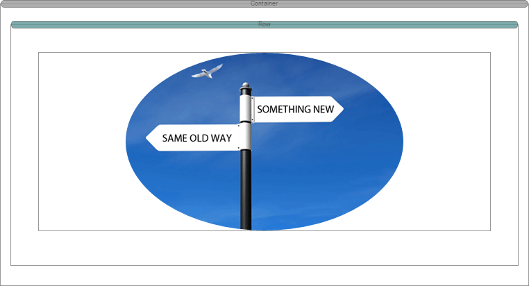
Image 3 (Oval / Circle Shape)
Another important option of the Image element is you can make the image link. You can find the image link option at the bottom part of the Style tab.
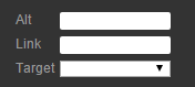
- Alt is the alternative text that is shown when the image is hovered over.
-
Link is where you put the redirect
url when the image is clicked. - Target is the option to display the redirect url eg. open the redirect url on the current window or the new window.
Video
Video is to display the .mp3, .mp4 or other media files eg. Youtube on your page. (Vimeo video, please use the Source option in the Text Element). What you need to do is only fill in the url of the video at the URL field and select the video screen ratio. Others are optional. Go to the Style tab to select the theme of the media screen.
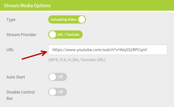
- Type is to select displaying the video or audio file. For S3 users, please select "Uploading Video" option.
- Stream Provider is to select the source of the media file eg. Youtube url or S3. (S3 user, please view the video tutorial)
- URL is to fill in the url of your media file. For YouTube, please use the url on the browser.
- Auto Start is to run the video immediately once the page is accessed.
- Disable Control Bar is to not allow the viewers to play forward or backward but pause or stop only.
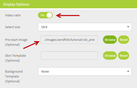
- Video ratio is to select the screen size of the video on the page. Options are Fix & Custom.
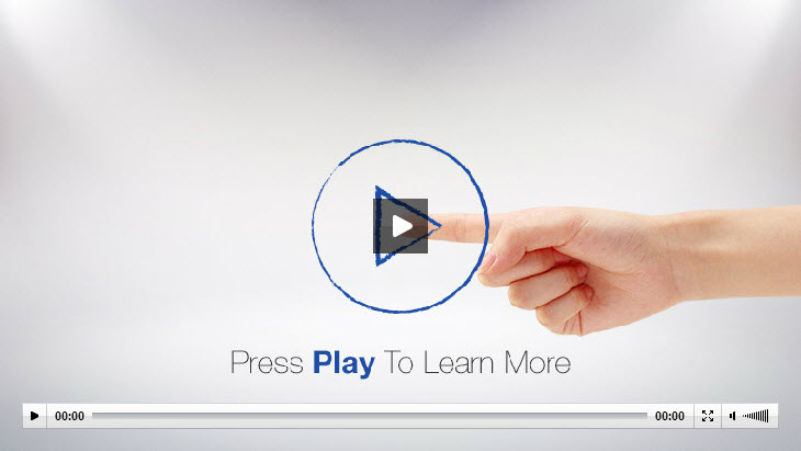
- Pre-start image is to select your own image to show while the video is not playing.
- Skin Template is to put the theme of video eg. skin, play button and menu bar.
- Background Template is to select the background style of the video skin.
Media Style
Media 1 (No Border)

Media 2 (Black Border)

Media 3 (White Border)
Optin Form
Optin Form is to insert the
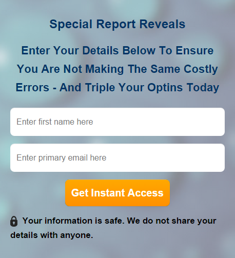
Opt-in Form Options
1. General Settings is to select the mailing list and other basic set up of the form.
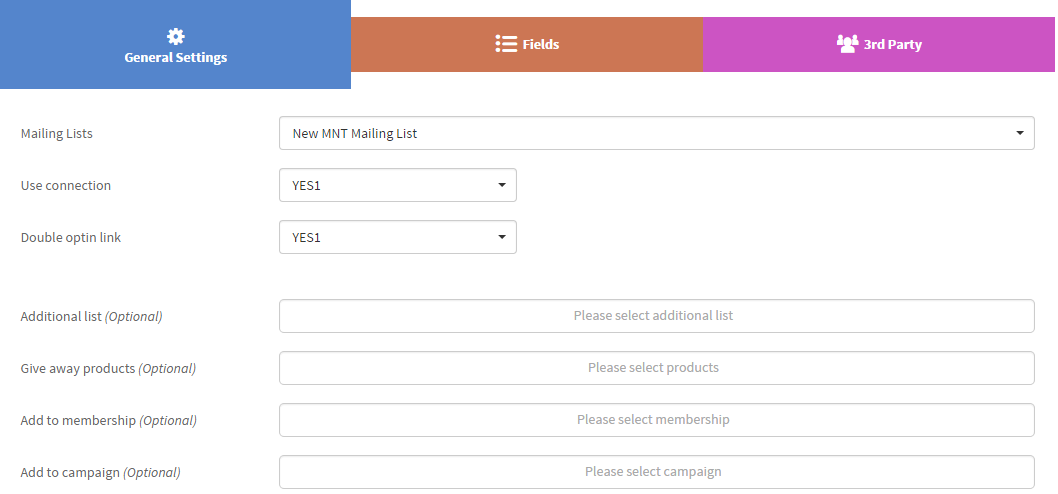
Main Settings
- Mailing List is to select the mailing list that you want to keep the subscribers after they opt-in.
- Use connection is to select the node of the Thank you page.
- Double optin link is to select the node of the confirmation page.
Optional Settings
- Additional List can be used if you want to add the subscribers to more than one list.
- Give away products is to give a complimentary product to the subscribers when they opt-in.
-
Add to membership is to add the subscribers to any membership level so they can log
in to the membership site. -
Add to
campaign can be used if you want the subscribers to be an affiliate automatically.
2. Fields is used to add more or remove the field that you want the customers to fill in.
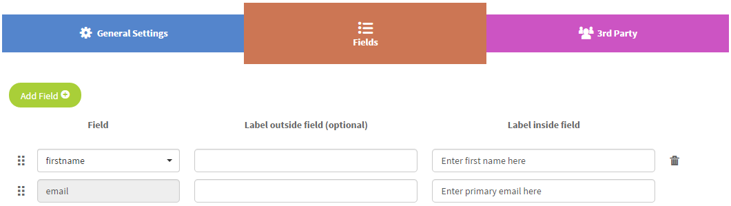
- Fields add as many as you desire. Options include First Name, Last name, Mobile and Country whilst
- Email is mandatory. You can choose to have the label outside or inside of the field, or both.
- Click Add Field to create more collecting fields
- You can also remove the fields by clicking the
 icon or rank the fields by moving
  the icon.
3. 3rd Party is used if you also use anther mail provider to send out the email message. The email of the subscribers will be sent automatically to the selected provider.
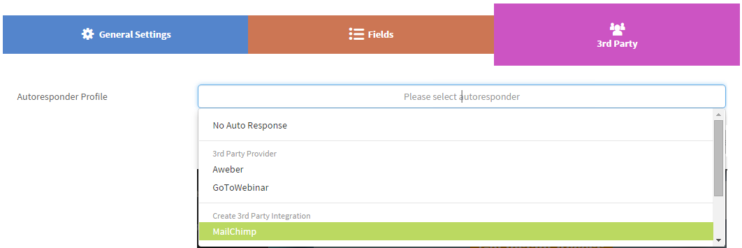
Before you can select the external mailer, you need to create an Autoresponder profile at Integrations first.
Select No Auto Response if you do not have any 3rd party mailer (it's default settings). For Aweber & Gotowebinar users, no need to create the autoresponder profile.
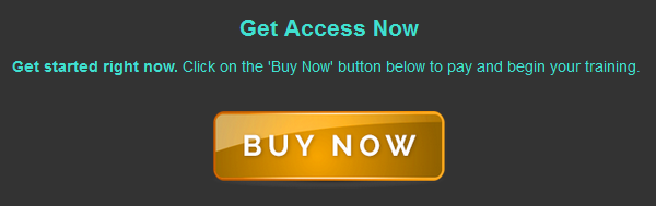
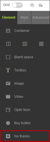
Buy Button
Buy button is used on the sales page for you to sell your products. Before you can use the Buy button, you need to create a product and set up its price first.
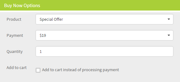
- Select the product and payment from the dropdown menu. You cannot select any free product here.
- Quantity is the quantity of the product that the customers will get each time they purchase.
-
Add to cart is not to direct the customers to the payment page immediately. They are able to buy other products before
check out. This option is available only for Buy Once payment.
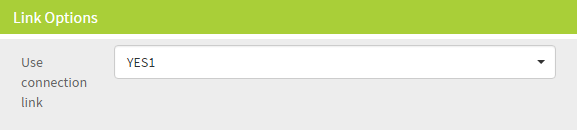
- Use connection link is where you select the link or node to direct your customers to the Thank You page after they pay. You can choose Yes1, Yes2 or Yes3. It’s entirely up to you.
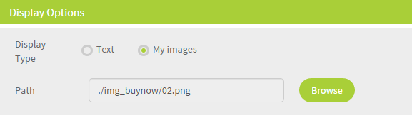
- Display Option is to use either Image or Text. You can upload your own button here if you want.
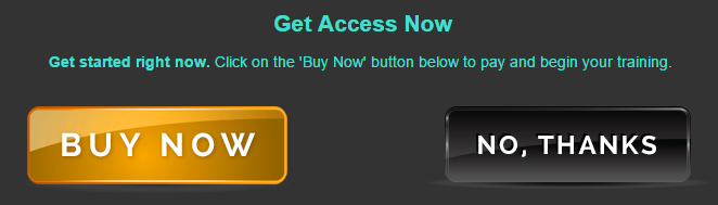
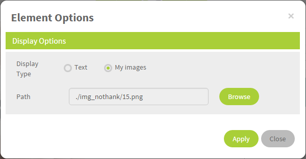
No, thanks
The No, thanks button allows you to connect to another page which offers something to the site visitor once they leave the page. You can use your own text or image.
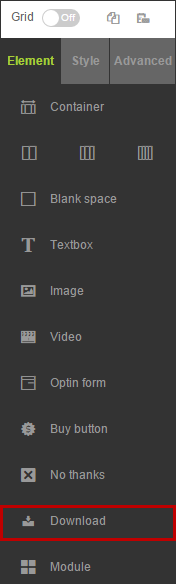
Download
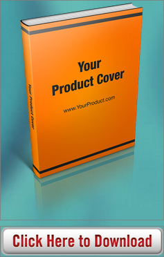
Download is used if you allow your customers to download files from your website. What you need to do is only put the url of your file here. So you need to upload the file elsewhere. You can even use your own download image if you want.
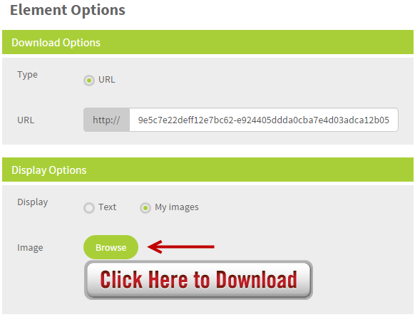
- At Type, enable URL option. Then put the URL of your file at URL field without
http ://. - At Display, you can select either the text which you can enter your own text or quote or image option.
- For Image, click Browse to select the download image or upload your own image.
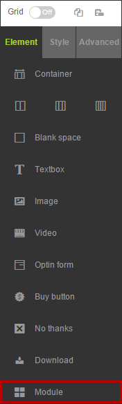
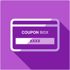
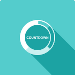
Module
Module is to insert the miscellaneous elements. For now, there are only the Testimonial box, Coupon Box & Countdown Timer. We will add more add-on elements in the Module feature soon.
Testimonial Box

Coupon Box
Countdown Timer
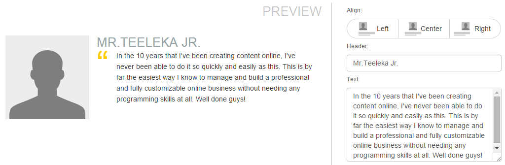
Testimonial Box is used to show some feedback of your customers. You can fill in their quote and image.
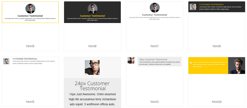
To use the Testimonial box, at Module, select Testimonial.
- Select its theme. Select the alignment of the image and text.
Header is to fill in the name of your customer.- Text is to fill in what they have said regarding your product.
- Once finished, click Apply button.
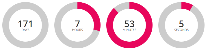
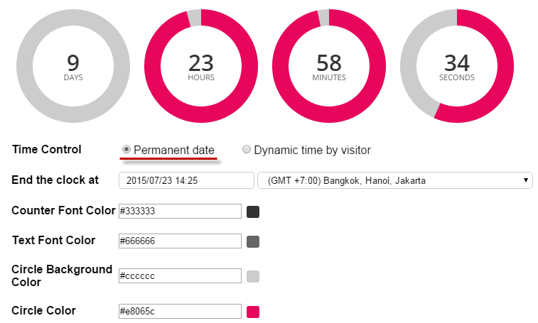
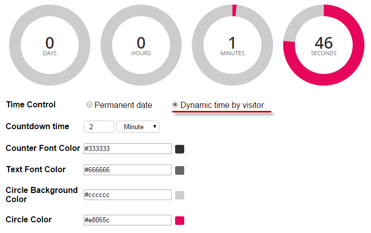
Countdown Timer is to show the time remaining before any launch eg. product launch, webinar lauch or any scheduled event. It shows the backward time counting.
- To use the Countdown Timer, at Module, select Add-ons and then Circular Countdown.
- Then schedule your event.
- There are 2 kinds of Countdown Timer: Permanent date & Dynamic time by visitor.
Permanent date is to set up the exact date of the event whereas the Dynamic time by visitor shows the backward counting time of each visitor. So the event time of each of them will be different.
Advanced Settings
Advanced is the special settings of the selected element. You can use it so your page looks more attractive or professional. Leave this option if you don't want. It's not obligation.
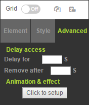
Delay Access
It's the time release of the selected element. It means that this element can appear or disappear at a specific time.
- Delay for .... s is to enter the amount of seconds that you would like to delay the display of the element.
- Remove after ... s is to enter the amount of seconds that you would like the element to be removed after.
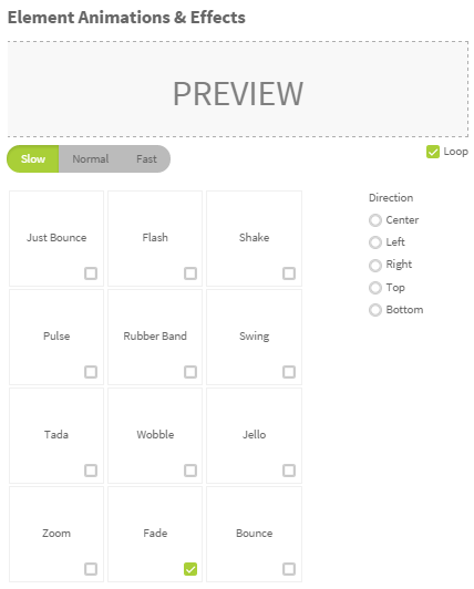
Animation & effect is used to add some effects to the selected element eg. swing, fade, flash or zoom.
- Select Slow, Normal & Fast for speed.
- Enable Loop if you want to always run the animation.
- Direction is to select from which side the animation will be starting.